Poster 1, Progress 2: Invisible Darkness
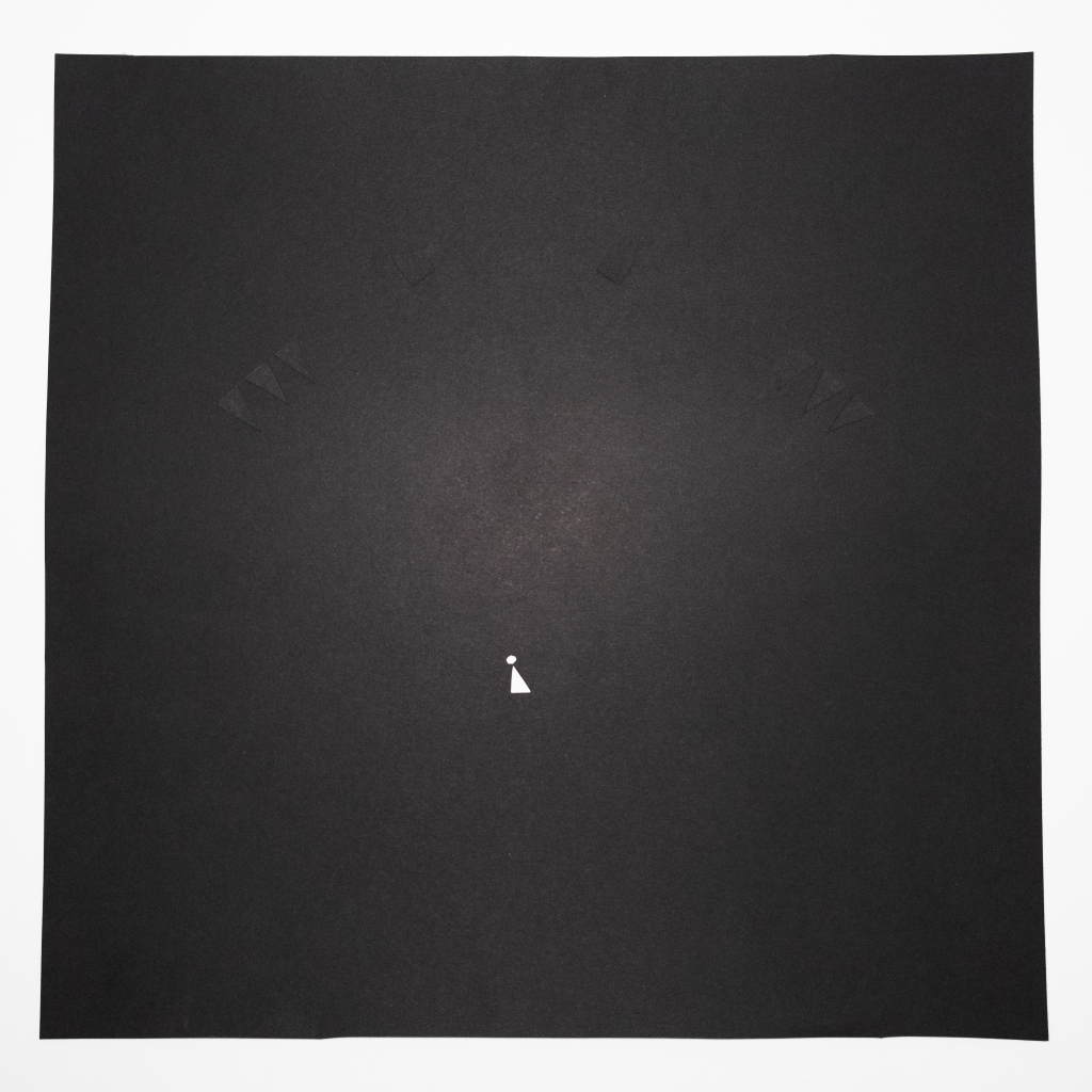
Continuing on from my last post, I started to work on translating the first design into a final poster. I continued with the gestalt principle of closure and area making up the bulk of the monster in your mind. I played around with the sizes of the person, the parts of the monster, and placements of the various items before settling on this.

I used collage so the monster would be the same color as the background, making it hard to see at first (This also made it a pain to get pictures of that captured it fully).
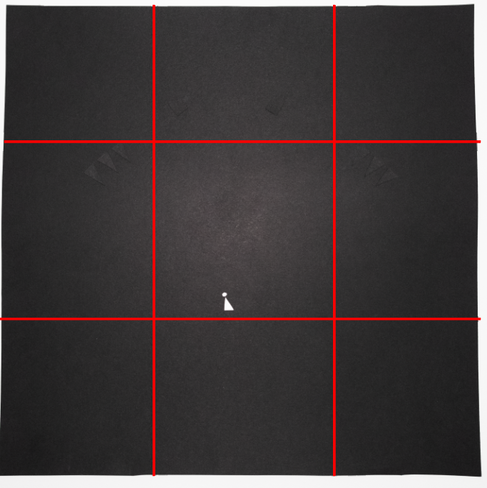
I used the rule of thirds, placing the claws at the intersections, and the person along the lower third line to make it easier for the eyes to notice the details of the claws, and thus the monster.

The full effect of the hierarchy (First the person, then the claws and eyes of the monster) really depends on the lighting, so I could have done that better.
As a lot of the design is abstracted (due to the nature of geometric shapes) people could easily miss that the white is a human. Which all depends on what signifiers you recognize. I may have been able to create something that signified a human to more people, although my inexperience with this medium and own experiences led me to pick this.
The monsters claws are a form of repetition, I tried to make all of them the same size and shape, then used the gestalt principle of proximity, similarity, and continuity to create the feeling that they where grouped together, and guide the eye up to the monsters eyes if they hadn't seen it yet.
References:
1. Chapman, C. (2018). Exploring the Gestalt Principles of Design. Toptal Design Blog. https://www.toptal.com/designers/ui/gestalt-principles-of-design