A Virtual Flip-book: From Brain to Screen
The first assignment for my Designing with Data class was to create a flip book by designing an animation in Processing 3 and then printing it onto a flip book.
As Covid-19 is want to do, it came and shut everything down again. So, we ended up not making the physical project.
As I already have knowledge of programming and have done it for a while (not specifically processing, but the principles are really the same) most of my effort was focused on the design elements of this project.
Week 1: Ideation
Week 1 was when we where introduced to the project. I spent the start of it finding my statistic I was to represent (From the sustainable development goals on the UN website). After a bit of back and forth, I decided I just needed to pick one and start iterating, I would find out if it was the wrong one soon enough. I picked one about ice water.
Less than 3 per cent of the world’s water is fresh (drinkable), of which 2.5 per cent is frozen in the Antarctica, Arctic and glaciers. Humanity must therefore rely on 0.5 per cent for all of man’s ecosystem’s and freshwater needs.
Taken from the Sustainable Development goals website.
As I had suspected, once I started jotting ideas down onto paper, I realized that this wasn't going to work. The statistic was just too small to represent in an effective way. So I scrapped it, as the idiom goes "Fail Faster". I needed something with a larger stat so that it could be visually represented. So I went back and chose a different stat.
Each year, an estimated 1/3 of all food produced – equivalent to 1.3 billion tons worth around $1 trillion – ends up rotting in the bins of consumers and retailers, or spoiling due to poor transportation and harvesting practices
Taken from the Sustainable Development goals website.
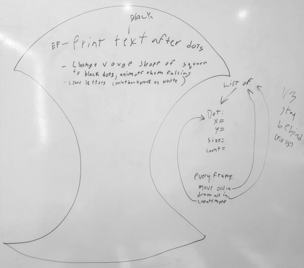
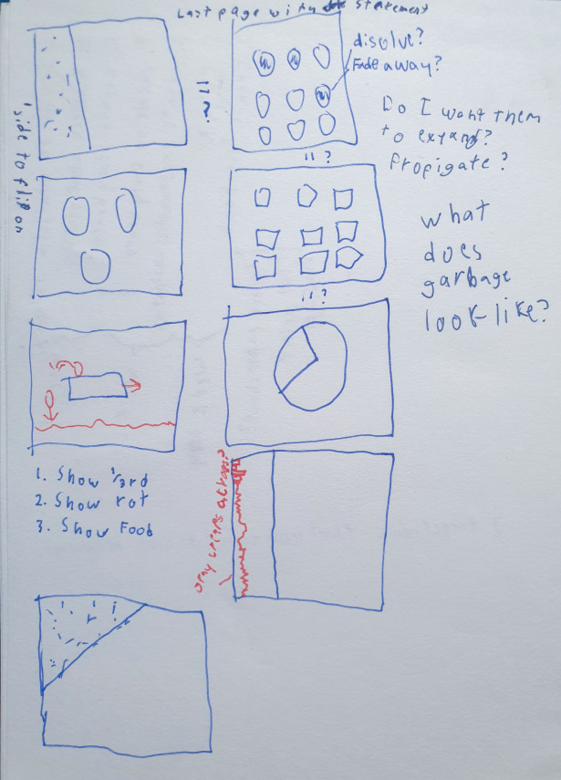
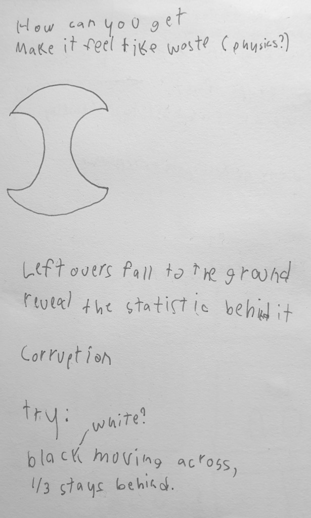
Sketching out some ideas based on this I came up with a few points that I wanted to show:
- Show that it's 1/3.
- Show that 1/3 is rotting, as that's the most visceral idea from there.
- Show that it's food
I placed these in order of importance, and checked out a few other versions.
Week 2: Scripting and Iteration
After getting some feedback from the class I started scripting. Creating a version, then expanding from there, splitting into multiple variations later.

This was probably the one that I learned the most technically from. As this was one of my first Processing scripts, although definitively not my first program, so I knew a lot of the basic ideas if not the syntax.

I also created a glitch in this one, where I set the x value of the dot TO 1/3 if it was over, instead of re-creating it UNDER 1/3. I fixed that in latter iterations.


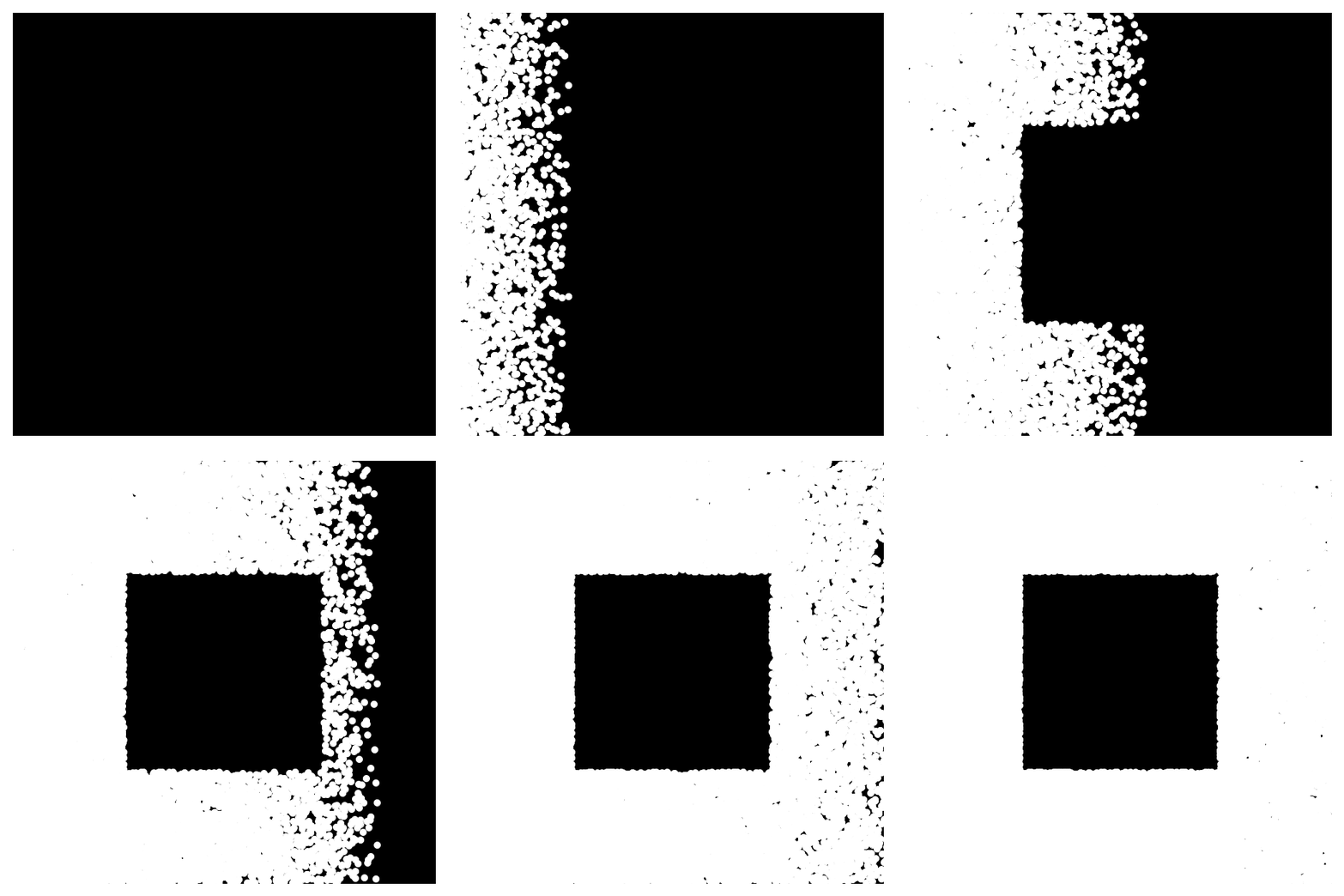 Doing what I could with the idea of “What does garbage look like?” I decided to make a square that would be left behind in the middle.
I realized a bit of what can be alluded to via the placement of other colour shapes, as the square didn’t exist on the page, it was just an area that the dots would not be placed.</figcaption>


Week 3: The Final Week
I spent more time on this project during this week than any of the other weeks. First I did some more work on the versions of the animation, following the feedback I gained from this weeks class. Then most of my time was spent polishing the final project.


I introduced a glitch here that I decided not to fix at the time, as this was more experimentation than a final project, which is that it leaves a line of black at the bottom after falling.


This gave me 3 variations on the animation that I was to choose for my final submission.
I decided to run these 3 by the instructors quickly and they confirmed my assessment that the latest version was the most effective.
Thus I reached my final design, which you can view here.
References:
1. Processing Foundation (n.d.). Processing.org. Retrieved 21 August 2020, from https://processing.org/
2. Martin. (n.d.). Sustainable consumption and production. United Nations Sustainable Development. Retrieved 21 August 2020, from https://www.un.org/sustainabledevelopment/sustainable-consumption-production/
